



























Dark Patterns Explained: How Apps Trick You Into Saying Yes
Dark patterns are design tricks that nudge you into decisions you didn't mean to make, and India now has rules against them.
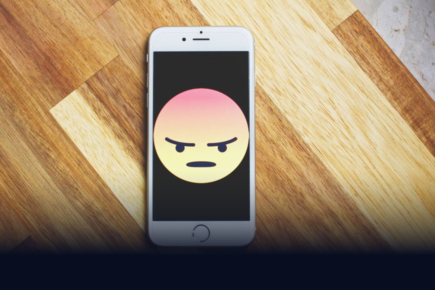
You tried to cancel a food delivery app's premium plan last month and gave up somewhere around the fourth "are you sure?" screen. That wasn't a badly built app. It was built exactly like that on purpose.
What exactly is a dark pattern?
A dark pattern is a piece of app or website design — a button, a pop-up, a pre-ticked checkbox — built specifically to push you toward a choice you wouldn't make if the interface were neutral. The term was coined by UX (user experience, basically how an app or site feels and behaves to the person using it) researcher Harry Brignull back in 2010, and it's stuck because it describes something most people have felt but never had a name for: that nagging sense of being outmanoeuvred by your own phone.
This isn't the same as persuasive marketing. A billboard trying to make you want a product is fair game. A dark pattern works by exploiting how your eyes and brain scan a screen under time pressure — tiny grey "no thanks" links, giant green "yes" buttons, countdown timers that reset when you refresh the page. The goal is confusion or fatigue, not persuasion.
The usual suspects
Once you know what to look for, you'll spot these everywhere, from e-commerce checkouts to OTT subscription screens:
- Confirmshaming: the decline option is worded to make you feel bad, like "No, I don't want to save money."
- Forced continuity: a free trial that silently rolls into a paid subscription, with the cancellation flow buried four menus deep.
- Drip pricing: the price looks reasonable until convenience fees, taxes, and "platform charges" appear one by one at checkout.
- Fake urgency: "Only 2 left!" or a countdown clock that has nothing to do with real inventory or time.
- Pre-selected add-ons: travel insurance, donation top-ups, or extended warranties quietly added to your cart by default.
Why it works on smart people too
These tricks aren't exploiting stupidity, they're exploiting how human attention actually functions. When you're scanning a screen fast, your brain takes shortcuts, and interfaces with asymmetric choices — one option loud and colorful, the other tiny and grey — hijack that shortcut reliably. It's the same reason casinos don't need you to be foolish to keep playing.
A dark pattern doesn't need to fool everyone. It just needs to fool enough people, enough of the time, to move the revenue number.
India actually has rules against this now
This is where it gets locally relevant. In November 2023, India's Central Consumer Protection Authority (CCPA, the regulator under the Ministry of Consumer Affairs that enforces consumer protection law) issued formal guidelines identifying 13 specific dark patterns as unfair trade practices — things like false urgency, basket sneaking (adding items without consent), confirmshaming, and forced action. Companies found violating these can face penalties under the Consumer Protection Act, and the Advertising Standards Council of India has separately flagged e-commerce platforms for similar practices.
For Indian users, this matters in very concrete ways: it's why some apps have started showing clearer unsubscribe flows, and why food delivery, travel booking, and edtech platforms in particular have come under regulatory scrutiny for pre-ticked insurance add-ons and misleading discount countdowns. If you've ever filed a complaint on the National Consumer Helpline about a sneaky renewal charge, you were pointing at exactly this problem.
How to actually protect yourself
- Before entering payment details for any "free trial," search the app's name plus "cancel subscription" to see how painful the exit really is.
- Read checkout screens top to bottom once before clicking the big button — pre-ticked boxes for insurance, donations, or warranties hide in plain sight.
- Treat countdown timers and "X people are viewing this" banners as marketing noise, not real-time data.
- If a cancellation flow takes more than two steps, that's a signal, not an accident — document it and consider reporting it via the National Consumer Helpline or the CCPA's grievance portal.
None of this means every colorful button or limited-time offer is manipulation — plenty of urgency is genuine. But the next time an app makes a simple "no" feel unreasonably hard to find, that friction is the product, not a glitch. Slowing down for five extra seconds is usually all it takes to see the trick for what it is.
What's Your Reaction?
 Like
0
Like
0
 Dislike
0
Dislike
0
 Love
0
Love
0
 Funny
0
Funny
0
 Angry
0
Angry
0
 Sad
0
Sad
0
 Wow
0
Wow
0